


“Schedule Now” – Best Practices to Add Online Scheduling to Your Medical Practice or Health System Website
Adding patient appointment self-scheduling directly to your website is an excellent strategy for healthcare in 2021.

Grant Digital Access & Guide Your Visitors
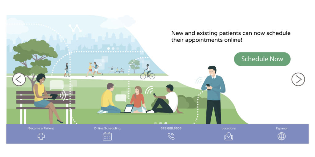
Digital patient access serves your existing patients and increases new patient acquisition. Patients appreciate the round-the-clock convenience. Self-scheduling’s efficiency also helps to optimize your schedule and keep time slots filled.
Your online scheduling’s Call-to-Action (CTA) button welcomes visitors to book an appointment. It’s a simple graphic — but it effectively guides the user experience and incites people to take action.
To get the most from patient scheduling software, we developed a list of best practices to help get the most traffic to your CTA button — and to make it as easy as possible for your patients to use right from the start.
The Online Patient Scheduling Terminology to Know:
- CTA: Your Call-to-Action button that links your patients to begin their self-scheduling session
- Copy: The text you use to direct and inform your visitor
- The fold: “Above the fold” is what’s visible on your homepage without scrolling. “Below the fold” requires scrolling down to read.
- Global Menu: A uniform menu that appears across several pages of your website, consistently showing how to navigate
- Hero image: Also called a hero header or hero banner, this is the full-width image at the top of your homepage
- Static: A fixed section of a website. It does not move when the visitor scrolls up or down.
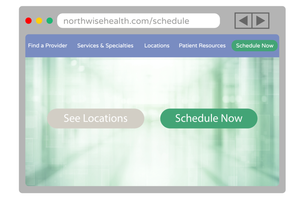
Online Scheduling CTA Best Practice #1: Create a Contrasting Design
One of the best ways to lead your patients’ attention to the scheduling platform is through your button’s design. Although you want your CTA to be on brand, it should never blend in with the rest of your website. You want your button to pop out from the rest of your site.
When introducing a new function to a website, it’s essential to make the functionality stand out.
Try using a bright color that contrasts the other functions on the page to create a focal point. A button should also be large enough for visitors to select intentionally.
It is also important to design for accessibility, giving thoughtful consideration to elements such as font size, button color and contrast for all visitors’ ease of use.
Online Scheduling Best Practice #2: Choose a Prominent Location(s)
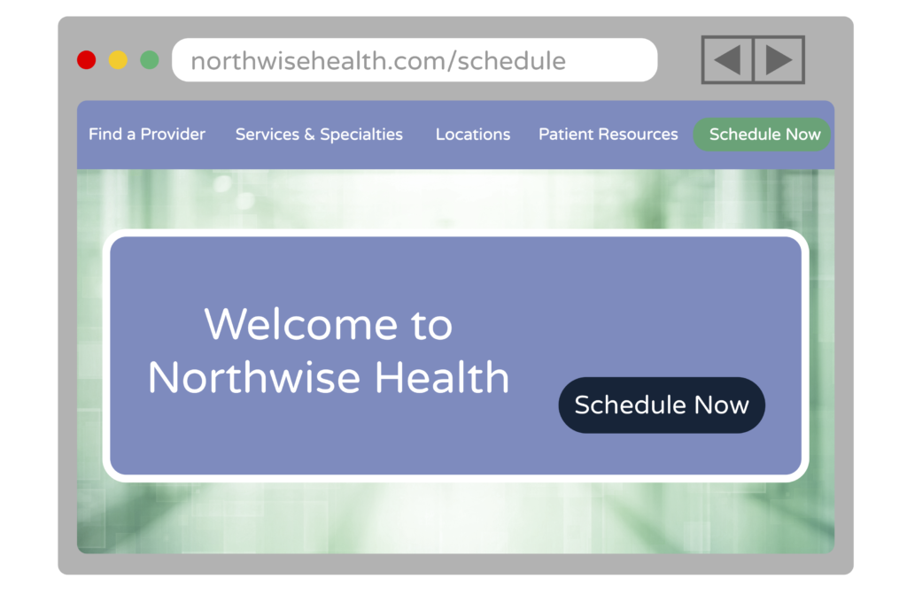
The best placement for your patient self-scheduling feature is at the top of your page, in a static, global header. Visitors should be able to make an appointment on your homepage, as well as department pages and individual provider pages. If you think about where people tend to research when visiting your website, it should be easy to determine the pages where scheduling an appointment is a natural next step.
Make it quick and simple for your visitors to learn how to self-schedule. Add a bright, color-contrasting CTA button to the top of your page next to the navigation. A hero image placed above the fold offers visual interest to draw attention.
In the hospital website banner below, we see a static online scheduling icon added to the navigation, and the new scheduling option has been called out with text and a contrasting “Schedule Now” CTA button.
Online Scheduling Best Practice #3: Using Actionable Language
When writing your CTA copy, ensure you use action-oriented, second-person verbs to get the highest click-through rate (CTR). Shorter copy typically performs best. A longer CTA requires a smaller font size and will be less prominent to your patients, whereas “Schedule now” indicates that this button allows a visitor to schedule an appointment immediately.
Other recommendations for scheduling button CTAs include “Book Now,” “Book My Appointment” or “Schedule Me.”
The Benefits of the Scheduling CTA
Offering online patient self-scheduling can increase the number of appointments booked simply by offering patients scheduling at their convenience. It can also increase new patient acquisition by attracting new visitors and quickly converting their visit into a booked appointment. The scheduling button has the potential to be the highest-converting action on your website.
Using your own customized guidelines to create scheduling criteria, you can fill open slots and balance provider workload. Automating many of the administrative tasks of scheduling allows you to reallocate staff to more meaningful tasks. With the right presentation and scheduling button design, you can deliver a better, simpler user experience that your patients will appreciate.
For More Information
Read more about implementing self-scheduling in your practice in our guide, The Top 2021 Trends in Patient Scheduling.